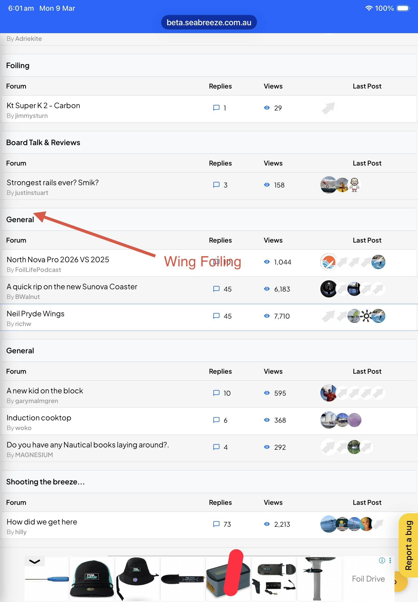
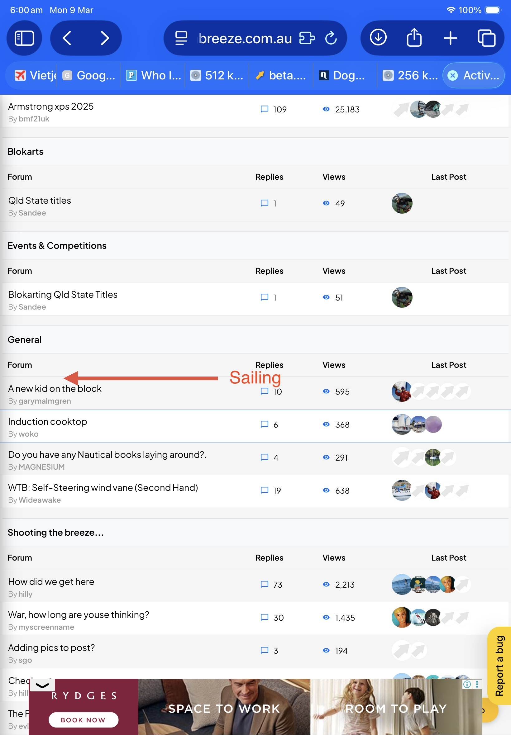
Looks nice and fresh but also a bit bulky. Posts take up quite a bit of space. Here you can see that in the old design, 3 posts fitted on a screen, now only 2 due to the margins and component placement.
I'd make sure the date is one line and embed the "Quote" button in the top as an icon or only show it on click/hover or so.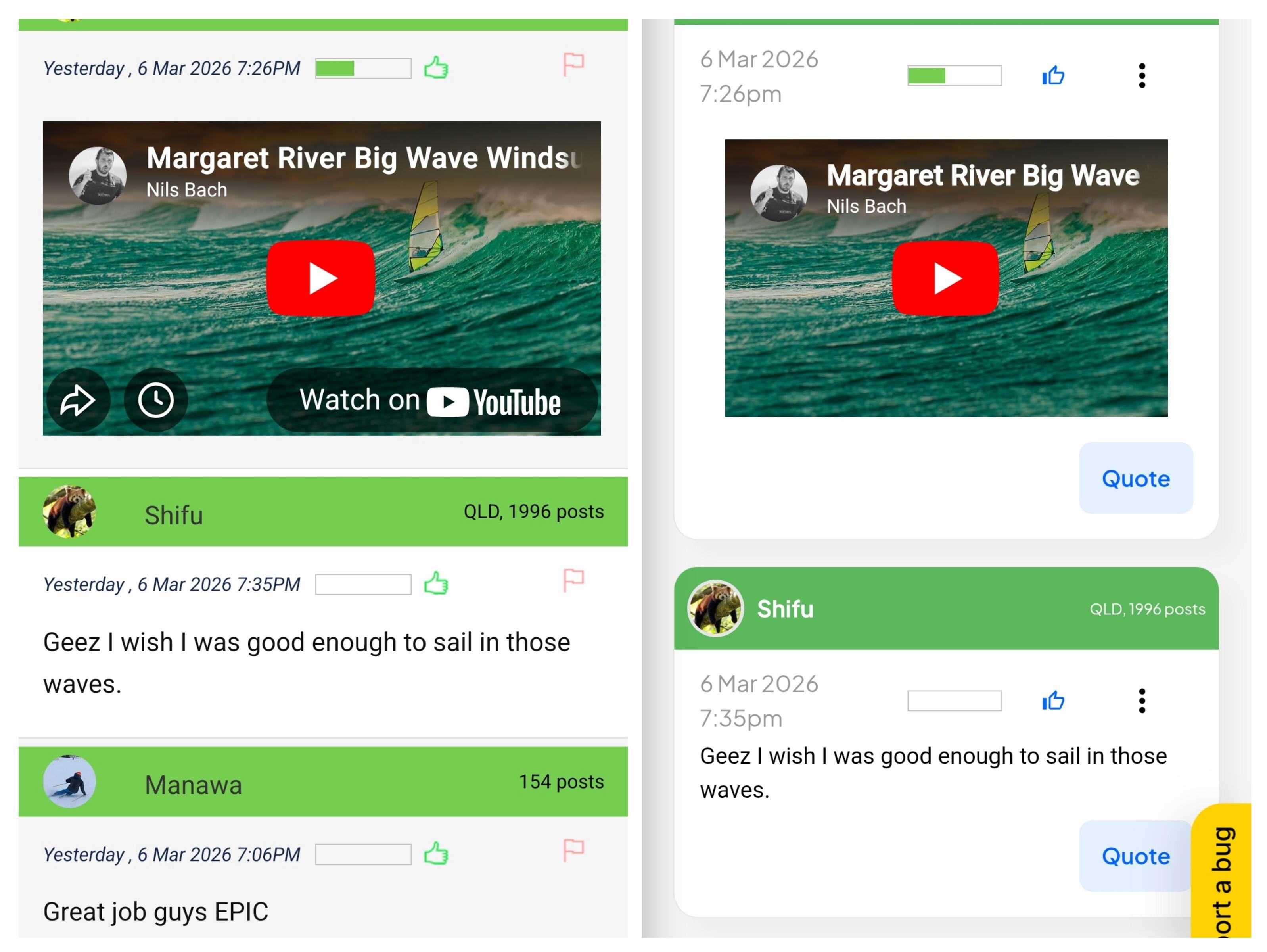
Also, the "Report a bug" button sits over the "Post" button so it's tricky to try to hit that button on my phone.
Hey everybody - thanks for your input so far, all the items that have been brought up have been addressed. Let me know if not. Let me know of any bothersome stuff, no matter how small. You can write direct, or post here, or use the feedback tool
Cheers ..
Select to expand quotelaurie said..
Hey everybody - thanks for your input so far, all the items that have been brought up have been addressed. Let me know if not. Let me know of any bothersome stuff, no matter how small. You can write direct, or post here, or use the feedback tool
Cheers ..
??????, ah, you mean the Beta site...
HI Laurie I would add more colour ...emojis are great .?....your emblem Seabreeze is a little small in the left corner ...just a few thoughts if you are making changes ??took me a while to figure out how to get post again you have to push emoji again ..I was trying to scroll down .to find post ..for some dummies like me it could be confusing .just my thoughts for a Wednesday
Select to expand quoteTardy said..
HI Laurie I would add more colour ...emojis are great .?....your emblem Seabreeze is a little small in the left corner ...just a few thoughts if you are making changes ??took me a while to figure out how to get post again you have to push emoji again ..I was trying to scroll down .to find post ..for some dummies like me it could be confusing .just my thoughts for a Wednesday
Thanks Tardy!
Not sure I understand the "how to get to post again you have to push emoji again" ... could I trouble you for more details on all this. Appreciate the feedback.
Speak up guys .. any gotcha's, nothing is too small to fix/adjust. ?
Bit of a long shot Laurie,
is it possible to add MetEye and Access models? That would be a game changer. No longer need to go to bom site.
Select to expand quotelaurie said..Tardy said..
HI Laurie I would add more colour ...emojis are great .?....your emblem Seabreeze is a little small in the left corner ...just a few thoughts if you are making changes ??took me a while to figure out how to get post again you have to push emoji again ..I was trying to scroll down .to find post ..for some dummies like me it could be confusing .just my thoughts for a Wednesday
Thanks Tardy!
Not sure I understand the "how to get to post again you have to push emoji again" ... could I trouble you for more details on all this. Appreciate the feedback.
Speak up guys .. any gotcha's, nothing is too small to fix/adjust. ?
ok .yes so I went to put a emoji on up top push ed the smiley emoji near the B I U S ,so I push the emoji and they all appeared ,great .....?I applied this one ....now I found you have to go back up to the top to the little emoji to get the emoji bar to disappear ,before posting ,I worked it out eventually ,but maybe another smiley face emoji with a X through it would be easier to work out for dummies like me .but I found it in the end .it had me stumped for a while ..but other than that ,I really like the bigger display on the reply pages .
I really liked the blue tab that we had coming from the bottom saying you have mail ,can we have that back that was cool?.I see you have a report a bug on the left ,I've never had one .but good to know where the button is now .I miss the water back ground ...as we are all water babies .
ps... I like the changes .?