I notice the pit crew have stickers on their sails, can we get some? I think we need to look as organised as our competitors. Let do it!! 2011 is our year!!
Cheers Russ![]()
![]()
![]()
The pit crews logo is cool ![]()
Good idea Russ, you could also have t-shirts, flags etc etc
But don’t we need a logo first![]()
Why hold back, go the whole hog. T-shirts, stubby holders, pens, fridge magnets and of course a whole hog with Tassie Speed Seekers written on the side of it (dead or alive it doesnt matter).
Hey guys perk drew one up at one stage "www.seabreeze.com.au/Media/View/4012048/Windsurfing/Anthony-Perkins-Logo/" I think it may need a little spiffing up ![]()
dad and i all ready have T-shirts, with the logo dad drew. maybe we could ditch the windsurf tas logo as its not really part of the Tassie Speed Seekers.
Izaak
I love the old Tassie speed seekers logo.
What do others think?
I agree the WT logo should go
and get tee's and stickers printed.
Kazza how much for tee's with that logo front and back?
Can we get an annual theme like: 2011 go like speedy gonzales
Cheers Russ![]()
![]()
![]()

Fantastic Kazza
You’re a legend; ok let’s sort out the logo, if we can use it? Or if we need a new one?
Copyright is important so if we need a new one let’s get the creative juices going and get about designing a new logo.
I asked Simone the wife an Architect if she could design one using the elements of speed, wind, and water. Sim said she would have a go.
Has anyone got good idea's? lets get going.
Cheers Russ![]()
![]()
![]()
Great archituctualy designed, should look awesome, but will be near imposible to print and probably go way over budjet![]()
![]()
![]()
Sorry Sim thats the tradesman coming out in me!
I couldn't quite make it work on paper, but I had the idea that taz ( similar to the cartoon) could ride a board, shaped like tassie or the sail shaped like tassie.
But any time I put pencile to paper it came out really wrong.
Maybe that could be incorporated into the elements ?
I dont know about using animated characters. Simple and stylish with a touch of slick. I think it needs to have a sense of direction and movement to it; like a sail at one end and Tassie Speed Seekers trailing off after it like a rooster tail out the back of a fast board. (Hang on I think I've seen that somewhere before, better check!)
I just looked at Perks old one and I recon its on the right track, turn it around, drop windsurf tas logo and tweak the font a bit. Maybe even move away from sraight lines and bold defind edges and go more for broken (water droplet/spray) fragmented look. Could even move away from the Turkish slipper turned up nose pointy bits, they were so 90's.
I like you love Perks first effort, Buzzy have a go at a modern version along the line of your points.
lets post it for comment.
Cheers Russ![]()
![]()
![]()
I have to agree with Kaleb, I think it should be a bit sleek and not go for a comical look.
Jedi don't you think Speedy Gonzalas looks a bit like Kenny, black hair, brown skin, skinny and little!
It is so hard putting down visualisation onto paper, I'm no graphic artist and don't have any great publishing software but thought I'd give it a go!
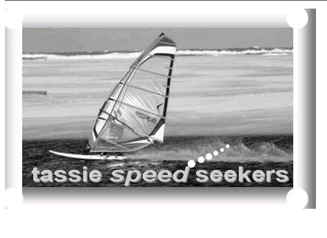
I realise it isn't fantastic but I thought why not use a photo of one of the team. I don't think it should be a solid block or anything like this is, it needs softened or blurred out edges, even getting rid of the background and replacing it, I don't know, just thought I'd put something out there! Also the font could be a bit more italic, especially the word speed.
I just googled "speed font", both web and images, and there's some damn fast lookin fonts out there, like this
www.linotype.com/142760/slipstream-product.html
Got no idea how to get them though, I think you have to pay for that one?
Dave?